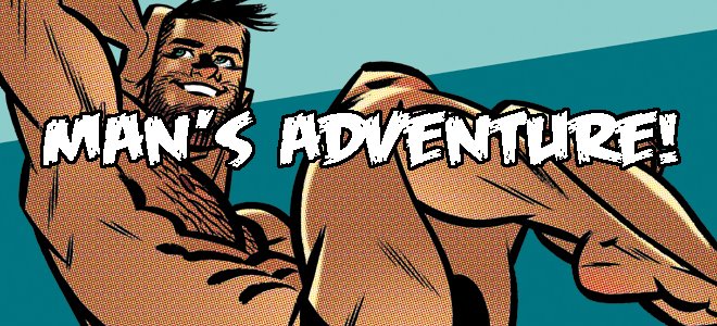

It's Guy-a-Day in stunning color! I woke up one morning, checked my e-mail as does nearly everyone in the civilized world...and what appeared before my sleep-puffy eyes knocked me out of my slippers and woke me right up! Someone had sent me his colored up versions of some of my Guy-a-Day drawings. Not just any 'someone' but super-colorist Michael Wiggam!
I was and am beyond flattered. I think Michael brings an amazing, painterly quality to my drawings. He finishes them off so beautifully that the inker in me is jealous. And unnecessary.
Michael started a blog of his own, Niveous, to showcase his stunning work. Hopefully he'll be adding more than just my drawings to his blog. He's been coloring Dark Horse's Star Wars: Clone Wars comics for a while now and he just gets better and better with each issue. It certainly doesn't hurt that he's coloring the art of superstar Scott Hepburn though, does it!


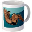
Saving the best for last. I am so madly in love with this final image. The color of the beach, water and the tan on the guy's skin (and that adorable untanned butt). I need this on a t-shirt, throw pillow, coffee mug AND tattooed on my back!
You'll be seeing more of Mr. Wiggam here, I guarantee!
best,
j.

12 comments:
These are gorgeous J!
Hands down the best "fan-colored" drawings I've ever seen.
(I use the term "fan" lightly since he's a 'super-colorist'.)
Wow.
Just...wow. The colors on the last drawing worke SO perfectly, it's really stunning! That would make a beautiful print.
Best,
J.
C. Edwards - Exactly my feeling. Somehow "fan" implies "amateur" and Michael is no amateur.
James - Your reaction was exactly my reaction. I could barely type when thanking Michael for such gorgeous art. I've run it past Mr. Wiggam, the idea of setting something up with CafePress or somehow getting prints. I've got to have it on a coffee cup!
Oh, and he's working from the lo-res files available on my blog. I've only just started sending him hi-res stuff. Incredible, eh?
j.
If I'm allowed, a slightly differing opinion: while the colors themselves are wonderful, I'm not sure the kind of art he's coloring lends itself to such color-created volumes. I think flatter colors would work better. For example, in the picture before last, the colors look more realistic than the art. But I agree the last image is extremely striking.
It never hurts to get another point of view and Michael's colorings more than prove that. I've seen the actual photo of DesPatie executing that dive and M.W.'s take is excellent and completely his own. It took me a bit to realize that some of the "Guy a Day"s didn't have backgrounds and that they were Michael's work. Talk about seamless! While I'm at it, I'll add my voice to the chorus: "The last drawing is totally, fucking hot!" Where the tanline and the un-bronzed ass meet just sizzles. A masterstroke Mr. Wiggam!
P.S.: Don't be too jealous Bones. As an inker you're no slouch. You have your own unique, and equally hot, style.
I'm amazed! I want to have it on my walls!
:)
Pure art!
François - Differing opinion is allowed :) I think, for me, the reason the painterly style works is that Michael has colored my pencil art. I sent him some inks, which is where I find painterly on a flat style doesn't work. We shall see!
I like how juicy he's made that tush in the black t-shirted guy.
Musclsvg - I also noticed Michael's excellent backgrounds. Sadly, the image with the record player sort of highlights the fact that I didn't use proper perspective :) but who would notice when gazing into those adorable eyes. Right?
And, thanks Musclsvg.
LTruzzi - Right on! I just had a thought...that final image on a beach towel! How cool would that be. It'd get stolen off the beach in a second!
best,
j.
"I like how juicy he's made that tush in the black t-shirted guy."
Funny, because that's exactly what I don't really like (again, it's not a criticism of his abilities, only of the aesthetic choices made). For me, those colors create volumes where none is needed, and bring a kind of dissonance with the line art.
Anyway, I have that kind of problems with lots of current, painterly colors. Not that I prefer flat colors! I've had that kind of discussion with Carlos Garcia, who draws and colors our erotic comic. I guess I'm beginning to be old-school...
Methinks there is a new "Dynamic Duo" in town! Anyways, I think Michael's colors enhance your drawings. Really helps describe the shapes and to define those d-lish bodies. The fact that some of those backgrounds are improvised by Michael blows my mind. You both are so talented and I will definitely try and continue to learn from your examples.
OH! And these colored versions would make a tasty cover to a J.Bone sketchbook for sale! ;)
The colouring reminds of a Norman Rockwell painting, if Rockwell did hot dudes. Makes you wonder about the "long lost" Rockwell sketchbook. You should invent it!
Wow!!!! I love them all!!!!
kisses from Spain!
Wonderful stuff!
Post a Comment